Flutter Implicit Animations
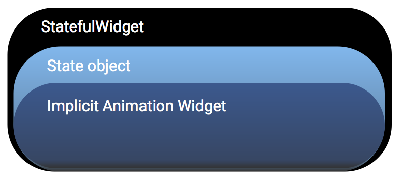
If you’re new to Flutter or new to animation, consider starting with the built-in Flutter implicit widgets. Implicit animations are useful when you want to quickly add an animation without having to write a lot of animation code because the Flutter implicit widgets already include the AnimationController, the ticker provider, the listener, and other animations elements.
Implicit animations start immediately when a property value changes—they take the property value change as an implicit command to start the animation.
Using an implicit animation widget
 |
1. Create your StatefulWidget.2. Create the State class to hold the animation object and the implicit animation widget.3. Specify the BuildContext to return the implicit animation widget, such as AnimatedOpacity.4. Add the animation object, the duration of the animation, and any parameters relating to the implicit animation. For example, you would set the opacity level for an implicit AnimatedOpacity widget.
|
To create your own reusable implicit animations, create a widget that extends ImplicitlyAnimatedWidget.
For customized animations, extend AnimatedWidget to create Transition animations such as the DecoratedBoxTransition or build your own Explicit animations using the AnimationController.
Implicit animation examples
The AnimatedOpacity and AnimatedCrossFade are two implicit widgets included in the widget library.
AnimatedOpacity example

|
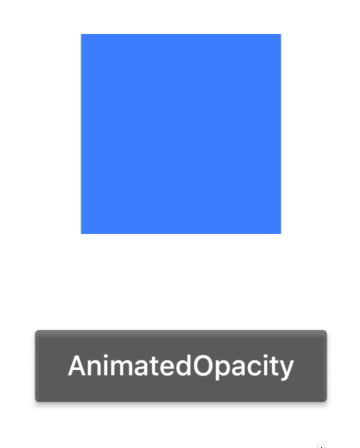
The AnimatedOpacity implicit widget automatically transitions a child's opacity over a given duration whenever the specified opacity changes.
|
The code for the AnimatedOpacity example is shown below. The AnimatedOpacity widget extends the ImplicitlyAnimatedWidget class and already includes the listeners, tickers, and other elements that define the animation—so when you reuse the AnimatedOpacity widget, you don’t need to specify those elements.
```Dart
import 'package:flutter/material.dart';

class LogoFade extends StatefulWidget {
  @override
  createState() => new LogoFadeState();
}

class LogoFadeState extends State<LogoFade> {
  double opacityLevel = 1.0;

  _changeOpacity() {
    setState(() => opacityLevel = opacityLevel == 0 ? 1.0 : 0.0);
  }

  @override
  Widget build(BuildContext context) {
    return new Container(
      color: Colors.white,
      child: new Column(
      mainAxisAlignment: MainAxisAlignment.center,
      children: [
        new AnimatedOpacity(
          opacity: opacityLevel,
          duration: new Duration(seconds: 3),
          child: new Container (
              width: 100.0,
              height: 100.0,
              color: Colors.blueAccent
          ),
        ),
        new SizedBox(height: 48.0),
        new RaisedButton(
          child: new Text('AnimatedOpacity'),
          textColor: Colors.white,
          color: Colors.black45,
          splashColor: Colors.blueAccent,
          onPressed: _changeOpacity,
        ),
      ],
    ),
    );

  }
}

void main() {
  runApp(new MaterialApp(home: new LogoFade()));
}
```
AnimatedCrossFade example

|
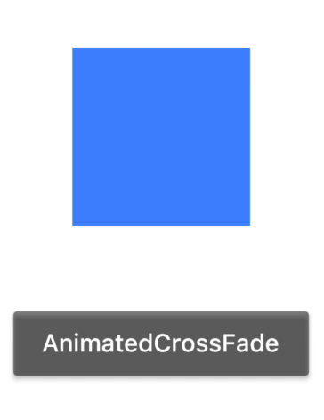
The AnimatedCrossFade implicit widget automatically cross-fades between two children and animates itself between their sizes.Mouseover the image to view the animation. |
The code for the AnimatedCrossFade example is shown below. The AnimatedCrossFade class extends ImplicitlyAnimatedWidget which already includes the listeners, tickers, and other elements that define the animation—they are implied or already stated, so you don’t need to add them here.
```Dart

import 'package:flutter/material.dart';

class ImageCrossFade extends StatefulWidget {
  @override
  createState() => new _ImageCrossFadeState();
}

class _ImageCrossFadeState extends State<ImageCrossFade> {
  CrossFadeState _crossFadeState = CrossFadeState.showFirst;


  _changeImage() {
    setState(() {
      if (_crossFadeState == CrossFadeState.showFirst)
        _crossFadeState = CrossFadeState.showSecond;
      else
        _crossFadeState = CrossFadeState.showFirst;
    });
  }


  @override
  Widget build(BuildContext context) {
    return new Container(
      color: Colors.white,
      child: new Column(
        mainAxisAlignment: MainAxisAlignment.center,
        children: [
          new AnimatedCrossFade(
            duration: const Duration(seconds: 3),
            firstChild: new SizedBox(
              child: new Container (
                  width: 150.0,
                  height: 150.0,
                  color: Colors.amberAccent
              ),
            ),
            secondChild: new SizedBox(
              height: 100.0,
              child: new Container (
                  width: 100.0,
                  height: 100.0,
                  color: Colors.blueAccent
              ),
            ),
            crossFadeState: _crossFadeState,
          ),
          new SizedBox(height: 48.0),
          new RaisedButton(
            child: new Text('AnimatedCrossFade'),
            textColor: Colors.white,
            color: Colors.black45,
            splashColor: Colors.blueAccent,

            onPressed: _changeImage,
          ),
        ],
      )
    );
  }
}

void main() {
  runApp(new MaterialApp(home: new ImageCrossFade()));
}
```
Implicit animations widgets
The Flutter widgets and material libraries include the following implicit animation widgets.
| Implicit widget | Description |
|---|---|
| AnimatedAlign | This widget is the animated version of Align which automatically transitions the child's position over a given duration whenever the alignment changes. |
| AnimatedContainer | This widget automatically animates between the old and new values of properties, such as a background color, when they change using the provided curve and duration. Properties that are null are not animated. |
| AnimatedCrossFade | This widget automatically cross-fades between two children. |
| AnimatedDefaultTextStyle | This widget is the animated version of DefaultTextStyle which automatically transitions the default text style (the text style to apply to descendant Text widgets without explicit style) over a given duration whenever the given style changes. |
| AnimatedIcon | This widget shows an animated icon at a given animation progress. The available icons are specified in AnimatedIcons. |
| AnimatedList | This widget provides a scrolling container that animates items when they are inserted or removed. The AnimatedListState class can be used to dynamically insert or remove items. |
| AnimatedListState | This widget is the scrolling container that animates items when they are inserted or removed. |
| AnimatedModalBarrier | This widget prevents a user from interacting with widgets behind itself, and can be configured with an animated color value. This widget is similar to ModalBarrier except that it takes an animated color instead of a single color. |
| AnimatedOpacity | This widget automatically transitions the child's opacity over a specified duration. |
| AnimatedPadding | This widget automatically transitions the indentation over a given duration whenever the given inset changes. This widget is the animated version of Padding. |
| AnimatedPhysicalModel | This widget is the animated version of PhysicalModel which represents a physical layer that clips its children to a shape. |
| AnimatedPositioned | This widget is the animated version of Positioned which automatically transitions the child's position over a given duration. This requires that the child is part of a Stack. |
| AnimatedPositionedDirectional | This widget is the animated version of PositionedDirectional which automatically transitions the child's position over a given duration. The ambient Directionality is used to determine whether the start is to the left or to the right. This requires that the child is part of a Stack. |
| AnimatedSize | This widget automatically transitions the child's size over a given duration. |
| AnimatedSwitcher | This widget does a FadeTransition between a new child and the child previously set on the AnimatedSwitcher. If the children are swapped fast enough (before duration elapses), more than one previous child can exist; one will transition out while the newest transitions in. |
| AnimatedTheme | This widget is the animated version of Theme which automatically transitions the colors and typographic choices of an application over a given duration. |